overview
Three sparks, one afterimage — a mark for an illustrator who draws light
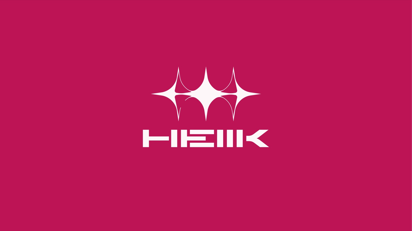
HellK is a Korean illustrator whose work lives where sacred imagery meets street energy. The identity condenses that tension into a single gesture: three four-pointed stars fused at the waist: the afterimage of a pen flashing across paper three times. Read fast, it's a sparkle. Read slow, it's a heartbeat monitor for inspiration — three spikes of it.
The wordmark answers the mark’s softness with machine-cut geometry. The double L is compressed into a triple-stroke “Ⅲ” module, so the name reads H·E·Ⅲ·K. A deliberate misreading that makes the logotype feel like a serial code stamped on the back of a devotional object.
brand direction
Gothic devotion, worn like streetwear
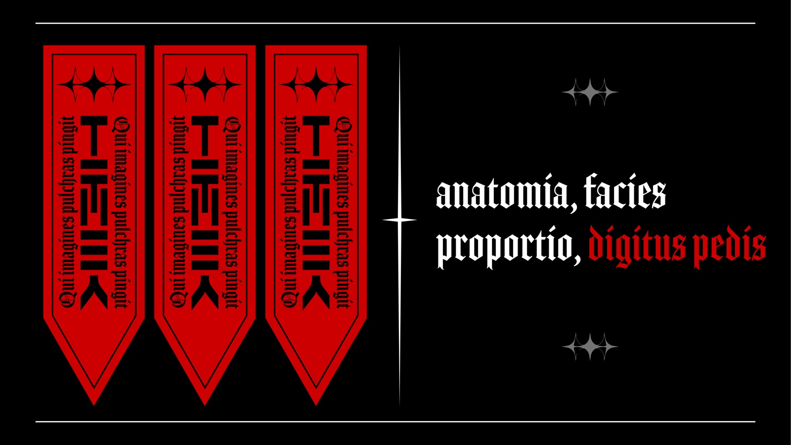
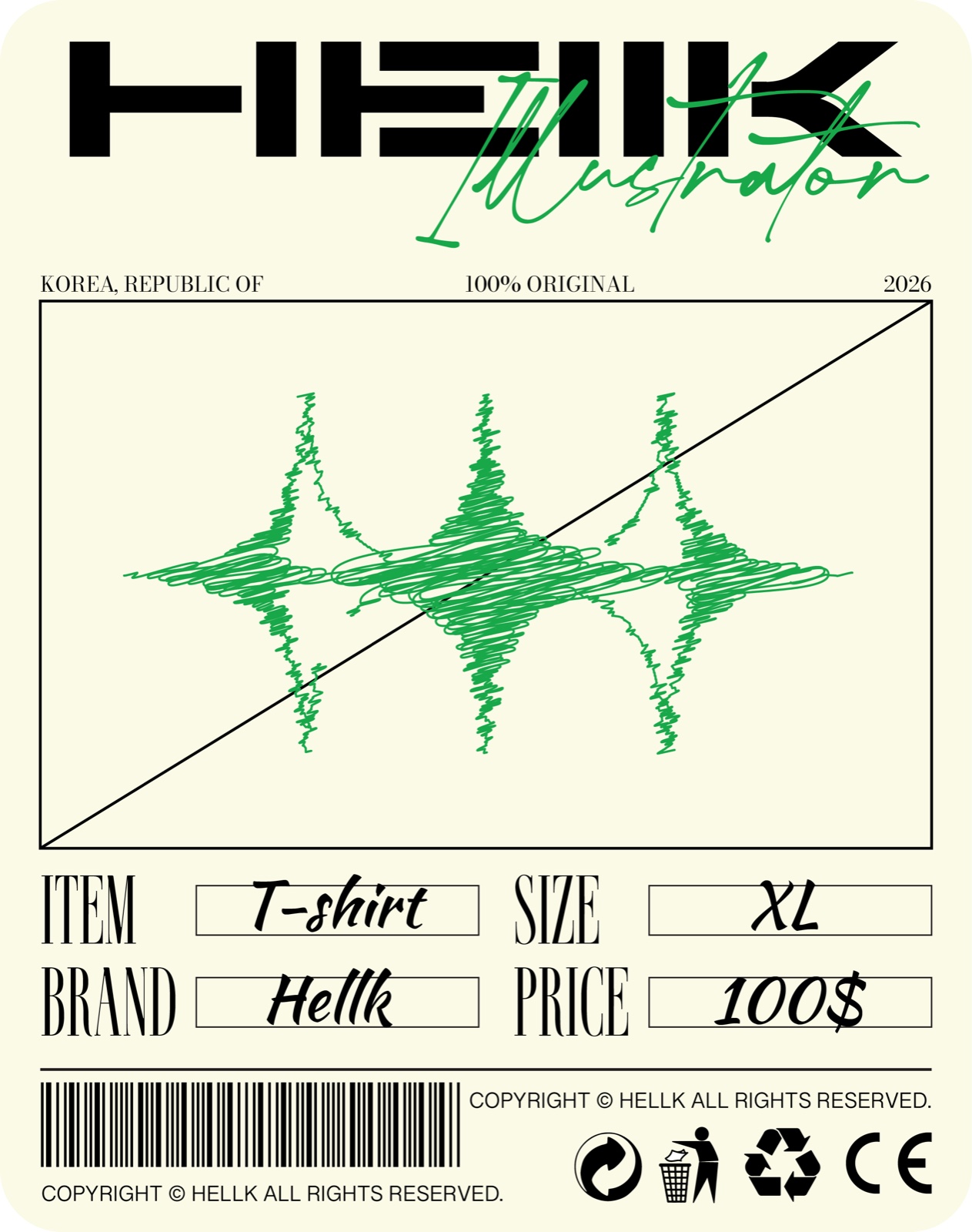
The system speaks two dialects. In liturgy mode, the mark sits on hanging banners in blackletter and red; the motto Qui imagines pulchras pingit, “one who paints beautiful pictures,” treated with the seriousness of a monastic order. In street mode, the same mark is scribbled in acid green on a bone-cream garment tag, barcode and care icons included — as if devotion shipped as merch.
One mark, two temperatures, because that’s what an illustrator’s practice is: sacred concentration at the desk, casual flex on the timeline.
Brand DesignLogo & SymbolTypographyApplications
color system
Hellfire Magenta
Liturgy Red
Void Black
Bone Cream
Acid Green
outcome
An identity that survives both a cathedral and a drop
The final system hands HellK a mark that scales from avatar to banner without losing its silhouette, a logotype that works as a signature stamp on artwork, and two ready-made visual temperatures to publish in. Everything ships from the same three sparks.
 LMNQ
LMNQ